
Mobile Website Design
Mobile Website Design in Orlando
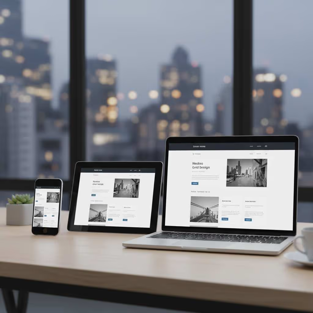
Fast, Responsive Sites That Work on Every Device
In Orlando, most customers browse websites on phones while searching for restaurants, services, and shops. This page covers mobile website design services that create fast-loading, touch-friendly sites optimized for smartphone users. These services work for businesses with high mobile traffic, sites that load poorly on phones, and companies losing customers to competitors. We start with mobile-first design strategy, then responsive development that works across all screen sizes. Capture more customers with websites designed for how people actually browse and search today.


Mobile Website Design Prioritizes Touch Navigation, Fast Loading, and Readable Text on Small Screens
Orlando businesses with existing sites that perform poorly on smartphones and tablets lose customers daily. Visitors who pinch and zoom to read text or struggle tapping tiny buttons leave immediately. An experienced Orlando web designer eliminates these frustrating experiences that cause visitors to abandon your site for competitors.
Tourist areas like International Drive see massive mobile search volume from visitors looking for dining, attractions, and services on the go. Tourists walking between theme parks search on phones for nearby restaurants or convenience stores. Sites that load slowly or display poorly on smartphones never get considered.
Touch navigation requires completely different design thinking than mouse-based desktop browsing. Buttons must be large enough to tap with thumbs without accidentally hitting adjacent elements. Menus need spacing that prevents mis-taps. Forms should minimize typing with smart defaults and mobile keyboards.
Text must be readable without zooming. Font sizes below 16 pixels require visitors to pinch and zoom, creating frustration that drives them away. Proper mobile design uses readable text sizes, appropriate line spacing, and sufficient contrast for outdoor viewing in Florida sunshine.
Best Mobile Sites Combine Clean Layouts, Large Buttons, and Quick Access to Contact Information
Service businesses and restaurants in Winter Park and Baldwin Park need phone calls and directions from mobile users. Cluttered layouts overwhelm small screens and hide important information. Simplified layouts and prominent contact options convert more smartphone visitors into customers who call or visit.
Orlando residents search for local services while driving or walking. Mobile sites must provide instant access to phone and map features. Click-to-call buttons let users tap once to initiate calls without copying numbers. One-tap directions launch navigation apps immediately.
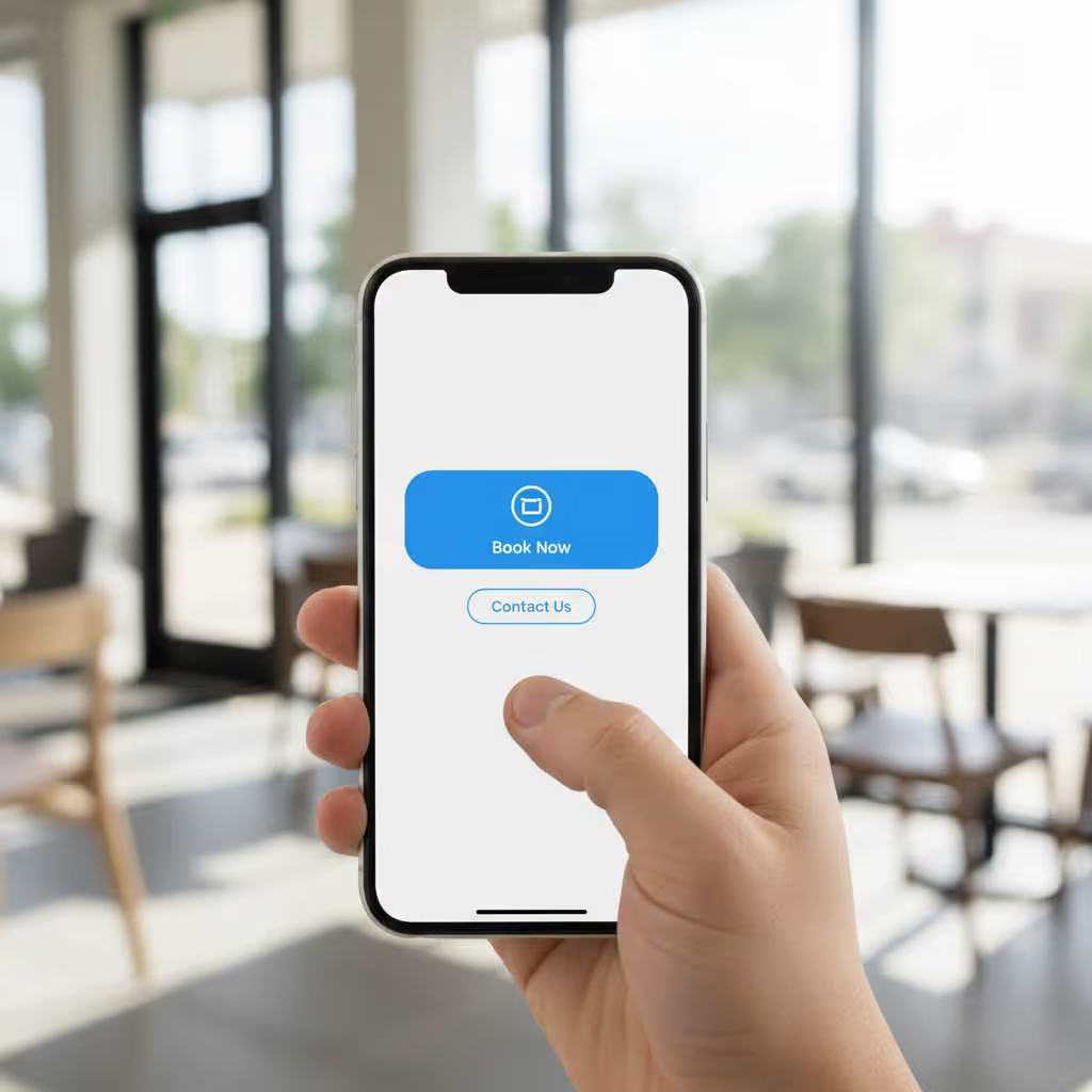
Large buttons prevent mis-taps and reduce friction. Touch targets should be at least 44 pixels square with adequate spacing between elements. Primary actions like "Call Now" or "Get Directions" deserve prominent placement and bold design that stands out.
Clean layouts keep focus on essential information. Mobile screens cannot display everything visible on desktop monitors. Prioritize key messages, website content, services, and contact options above the fold. Secondary information moves lower or behind expandable menus.

Responsive Design Ensures Your Site Works Perfectly on Mobile Phones and Desktop Computers
Businesses in Lake Noa and College Park serve customers who browse on multiple devices. Someone might research services on their laptop at home, then revisit your site on their phone while driving. One site adapts seamlessly to any screen size, eliminating need for separate mobile and desktop versions.
B2B companies in Orlando's business districts need sites that work for office desktop research and mobile follow-up. Decision makers research vendors on desktop computers during work hours, then reference sites on phones during meetings or site visits. Responsive design ensures consistent experience across contexts.
Responsive frameworks automatically adjust layouts based on screen size. Navigation menus collapse into hamburger icons on small screens. Multi-column desktop layouts stack into single columns on phones. Images resize proportionally without breaking page structure.
One codebase simplifies maintenance and updates. Changes made once apply across all devices automatically. Separate mobile and desktop sites require double the work for every content update or design change. Responsive sites eliminate this inefficiency.
Mobile-Optimized Websites Rank Higher in Google Search Results for Orlando Customers
Companies in Dr. Phillips and Thornton Park compete for top positions in local search results. Google uses mobile-first indexing, meaning it evaluates your mobile site version when determining rankings for all searches. Poor mobile experience hurts visibility for desktop searches too.
Competitive markets in downtown Orlando and Windermere require mobile optimization to appear above rivals in Map Pack. When multiple businesses offer similar services, technical factors like mobile performance become tiebreakers. Sites that load fast and work smoothly on phones rank higher.
Page speed directly impacts mobile rankings. Google penalizes slow-loading mobile sites because poor performance frustrates users. Optimized images, minimal code, and efficient hosting create speed that satisfies both ranking algorithms and impatient smartphone users.
Mobile usability errors hurt rankings and conversions simultaneously. Google Search Console flags issues like text too small to read, clickable elements too close together, or content wider than screen. Fixing these problems improves both search visibility and user experience.

.avif)
Professional Mobile Design Converts More Visitors Because Users Can Navigate and Act Easily
Orlando retailers and service providers get frustrated with mobile traffic that does not generate sales or inquiries. High mobile traffic with low conversions indicates design problems preventing action. Strategic mobile UX removes friction points that prevent smartphone users from completing forms or making purchases.
Theme park visitors and convention attendees in Orlando make quick mobile decisions. Someone searching for dinner near their hotel decides within seconds. Slow or confusing sites lose business instantly to competitors with streamlined mobile experiences.
Forms optimized for mobile reduce abandonment. Long forms with many fields frustrate smartphone users. Minimize required fields, use appropriate keyboard types for each input, and enable autofill. Multi-step forms feel less overwhelming than single long forms on small screens.
Visual hierarchy guides mobile users toward desired actions. Primary calls-to-action like "Book Now" or "Call Today" should be impossible to miss. Contrasting colors, strategic placement, and sufficient size make important buttons obvious even during quick scanning.
Frequently Asked Questions
What screen size should mobile website design use in Orlando?
Design for 375 pixels width as baseline since that matches standard iPhone dimensions. However, test on multiple devices ranging from 320 pixels (older small phones) to 428 pixels (iPhone Pro Max) for broad compatibility. Most mobile traffic falls between 360 and 414 pixels width. Responsive design should adapt gracefully across this entire range. Also test on tablets (768 pixels and up) to ensure intermediate sizes work properly.
Can I just use mobile website design templates instead of custom design?
Templates work for basic needs and tight budgets under $3,000. Many modern templates include responsive mobile design built in. They provide acceptable mobile experience for straightforward sites. Custom mobile design delivers better brand fit and conversion optimization. It allows unique layouts, specialized functionality, and strategic placement of elements based on your specific customers. Choose templates for simple sites with standard needs, custom design for competitive differentiation.
How do I test if my website works well on mobile devices?
Use Google's Mobile-Friendly Test tool to check basic compatibility and identify obvious issues. Check your actual site on real phones including both iPhone and Android devices across different screen sizes. Review analytics for mobile bounce rates and conversion rates compared to desktop. High mobile bounce rates indicate usability problems. Ask friends or customers to browse your site on their phones and report frustrations. Mobile usability testing reveals problems analytics alone cannot show.
How much does mobile website design cost for Orlando businesses?
Mobile optimization of existing sites typically costs $1,000 to $3,000 depending on complexity and issues that need fixing. This includes responsive design implementation, speed optimization, and usability improvements. New mobile-first designs range from $3,000 to $10,000 for complete builds. Simple sites cost less while complex functionality or custom features increase investment. Mobile optimization delivers strong ROI through improved conversions and search rankings.
What makes a mobile website design different from desktop design?
Mobile design uses vertical scrolling instead of horizontal layouts since phones are tall and narrow. Touch targets must be larger than mouse click areas because fingers are less precise than cursors. Navigation simplifies through hamburger menus and priority-based organization. Loading speed becomes critical since mobile connections are often slower. Button placement considers thumb reach zones on smartphones. Text sizes increase for readability without zooming. Forms minimize typing through smart defaults and appropriate keyboards.
Should Orlando businesses design for mobile or desktop first?
Mobile-first design makes sense for most businesses since over 60 percent of searches now happen on smartphones. Design for smallest screens first, then enhance for larger displays. This approach ensures core functionality works on mobile rather than trying to squeeze desktop designs onto phones afterward. Exceptions include B2B software companies where desktop dominates usage. Check your analytics to see mobile versus desktop traffic percentages before deciding approach.

Take the leap
Get in touch with us and see if we're a right fit. We'll show you exactly what needs to be done to help you dominate your business on Google Maps & Online.